AI-Optimized Buyer Sourcing Dashboard for Commodity Procurement
Professional commodity buyers don’t come to a dashboard for “pretty charts.” They come to answer one question quickly: Can I source the right volume, at the right price, with confidence? This project redesigned an existing Buyer Commodity Sourcing Dashboard to reduce cognitive overload, clarify the sourcing journey, and introduce AI-powered decision support—so buyers could move from scrolling and guessing to seeing and deciding.
We set out to improve an already live sourcing dashboard, not rebuild it from scratch or “reinvent procurement.” The objective was to redesign the existing flow into a clearer, more guided experience that supports how buyers actually make decisions: quickly comparing options, assessing risk, validating supply confidence, and confirming price timing.
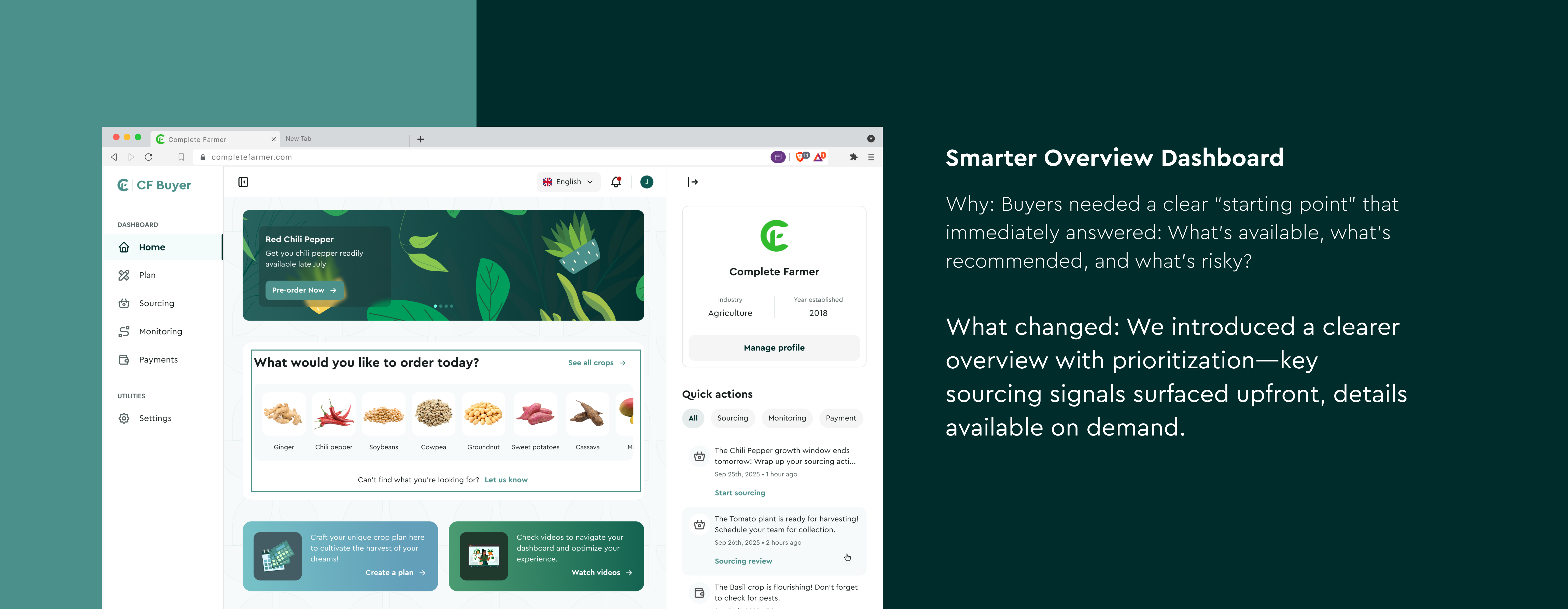
On the user side, we aimed to reduce cognitive overload, tighten the hierarchy, and surface the insights buyers need at the moment they need them instead of forcing them to hunt across screens, spreadsheets, and memory. On the business side, we wanted to increase sourcing conversion (buyers completing the flow), reduce avoidable ops involvement, and speed up the path from intent → quotation → purchase.
In short: turn the dashboard from a form-heavy workflow into an AI-optimized decision cockpit with smart forecasting, price intelligence, and auto-sourcing support built into the journey.

Role: Lead Product Designer
Product Area: Buyer Dashboard — Sourcing Experience
Company: Complete Farmer
Duration: 10–14 weeks (audit → redesign → validation)
Team: Design Team, Product Manager, Engineers, Sales Team, Ops Team
Tools: Figma, Jira, Useberry, Draw.io, Miro
Who is a Buyer?
A Buyer is a professional procurement decision-maker often a commodity trader, exporter, food processor, or procurement lead responsible for sourcing agricultural commodities at scale. They’re analytical, risk-aware, and time-sensitive. They care about volume reliability, quality standards, delivery timelines, compliance (certifications/testing), and of course: price.
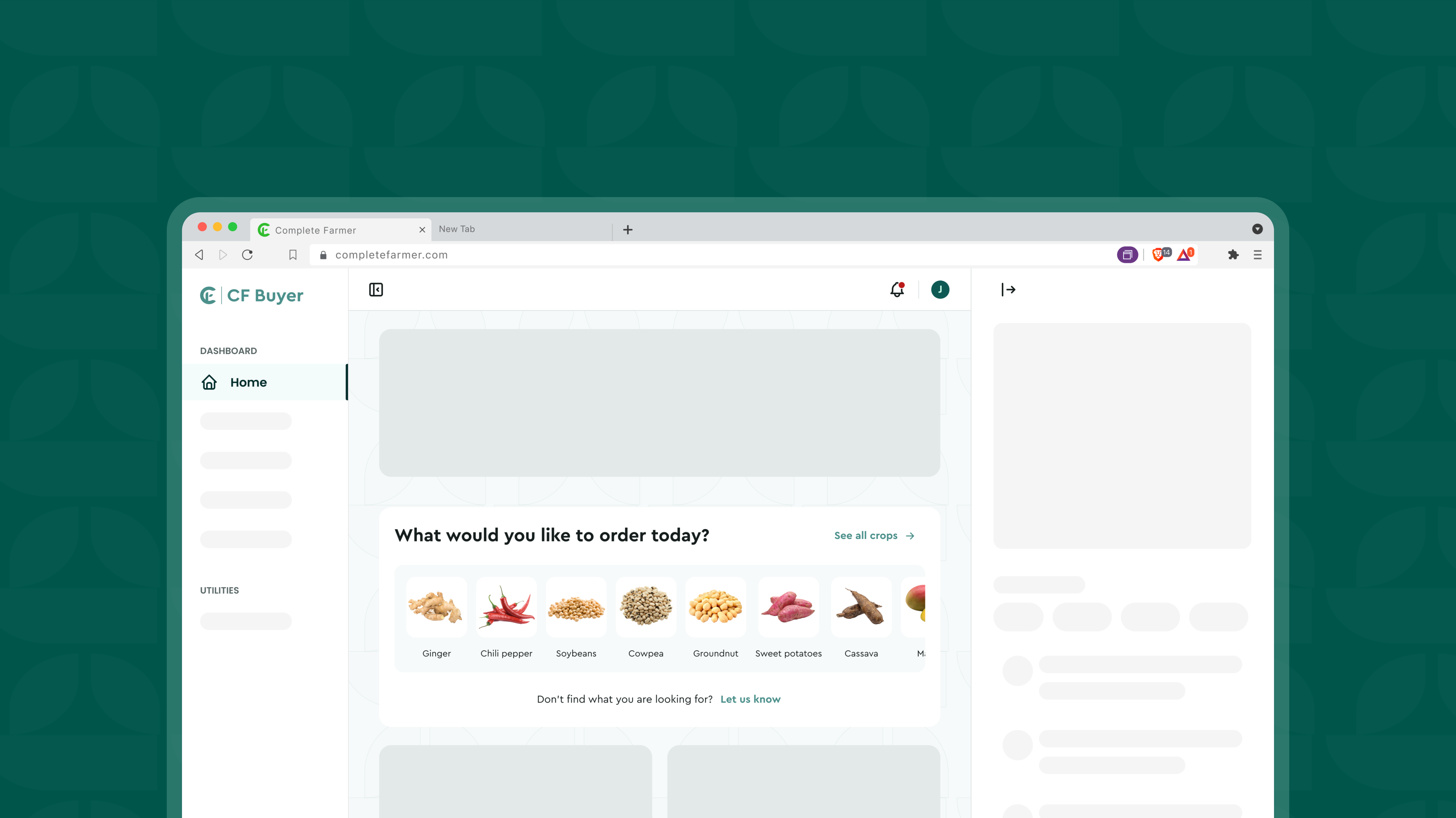
What is the Commodity Sourcing Experience?
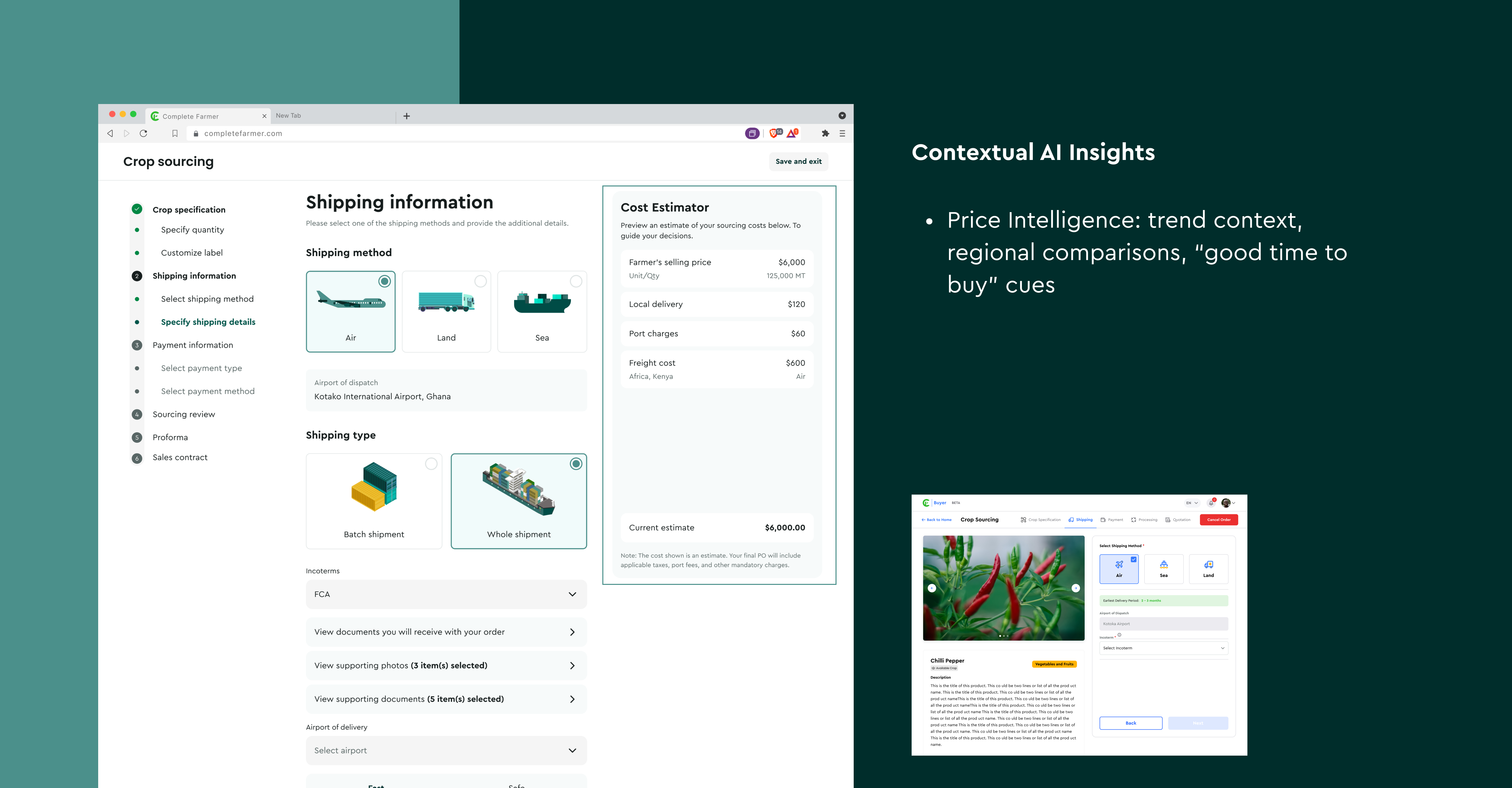
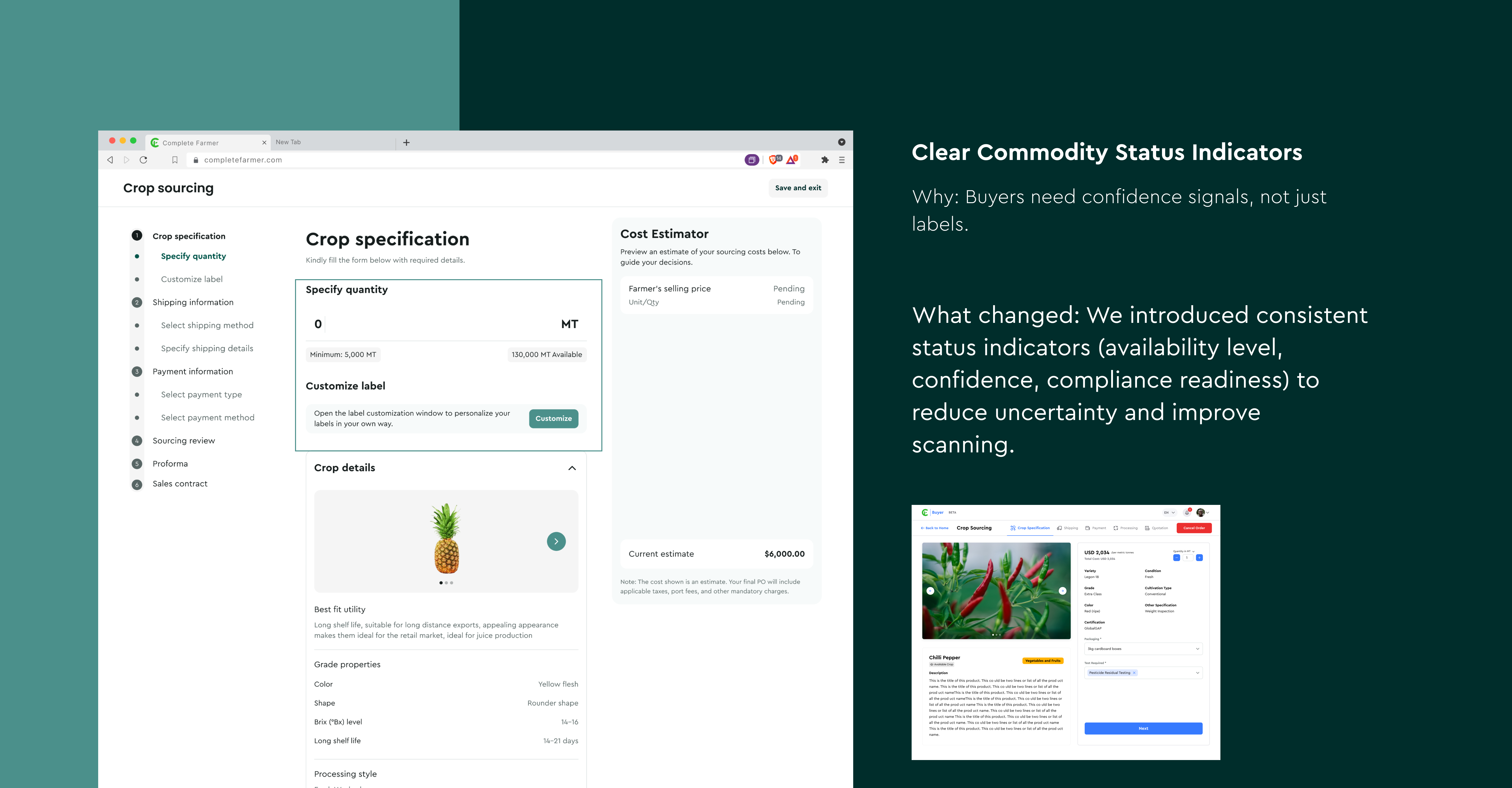
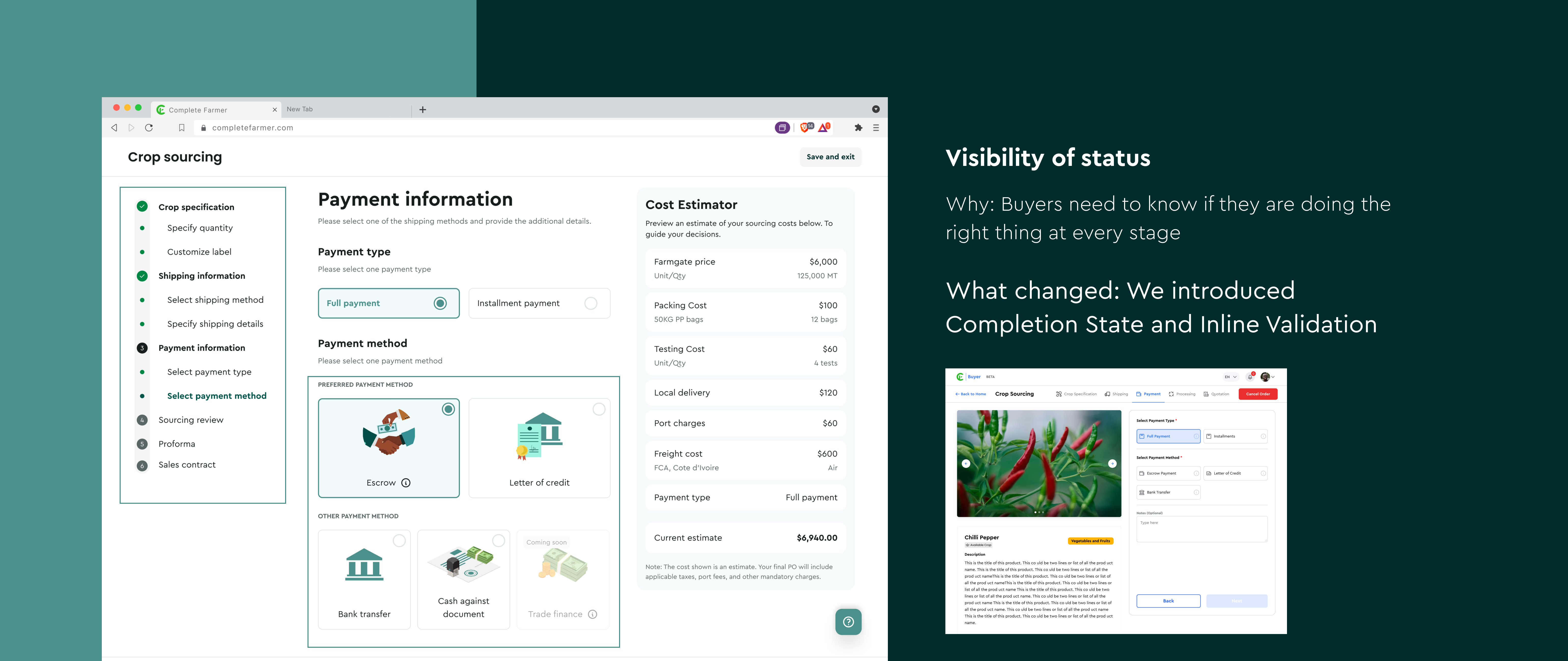
The sourcing experience is the end-to-end workflow buyers use to select a commodity, define specifications, set quantity, choose packaging/testing requirements, and proceed through shipping, payment, processing, and quotation. It’s not just “placing an order.” It’s a series of high-stakes decisions where uncertainty (supply, timing, and cost) can break confidence fast.
Why this matters in agrotech / supply chain
Agricultural sourcing isn’t static retail. It’s dynamic seasonality shifts supply, climate affects yield, logistics affect lead times, and market pricing moves. In this world, clarity and decision support aren’t “nice to haves.” They’re what separate a confident buyer from an abandoned flow and a closed deal from another email thread.
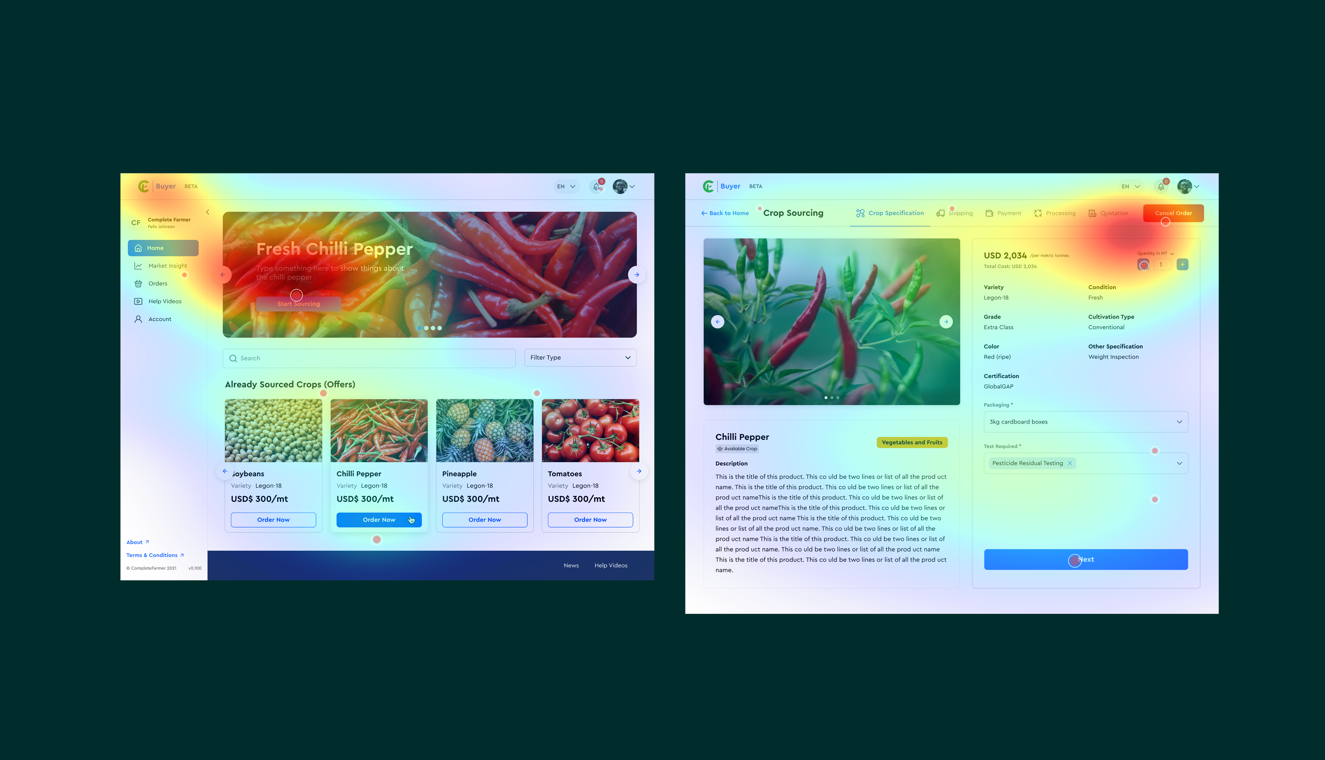
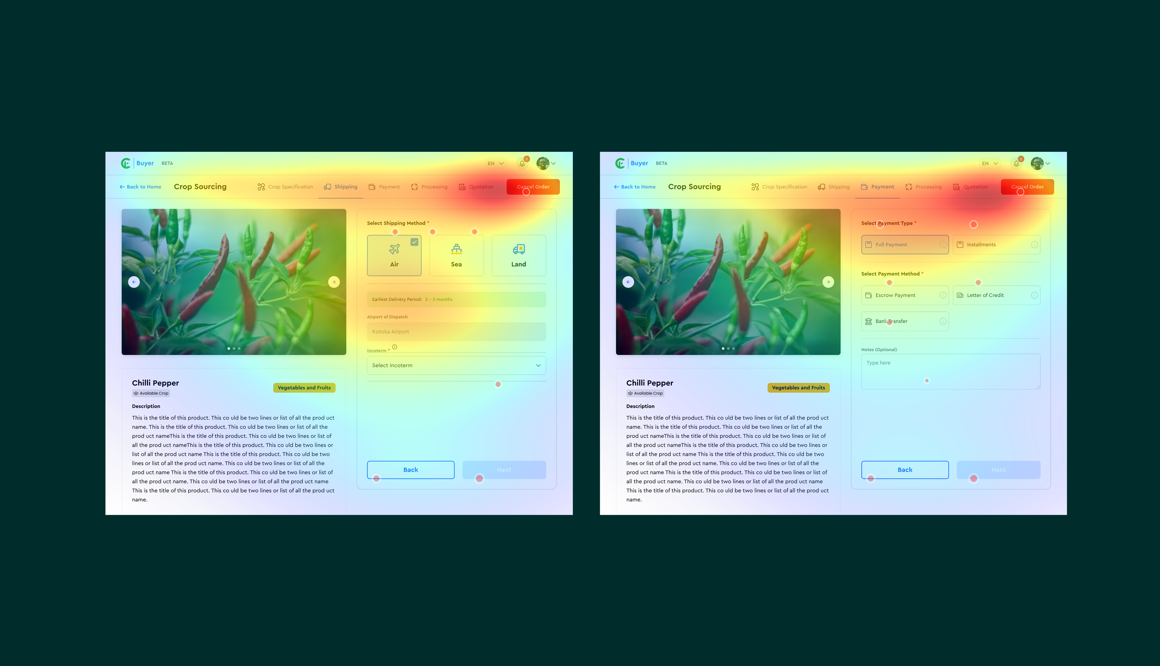
The Problem
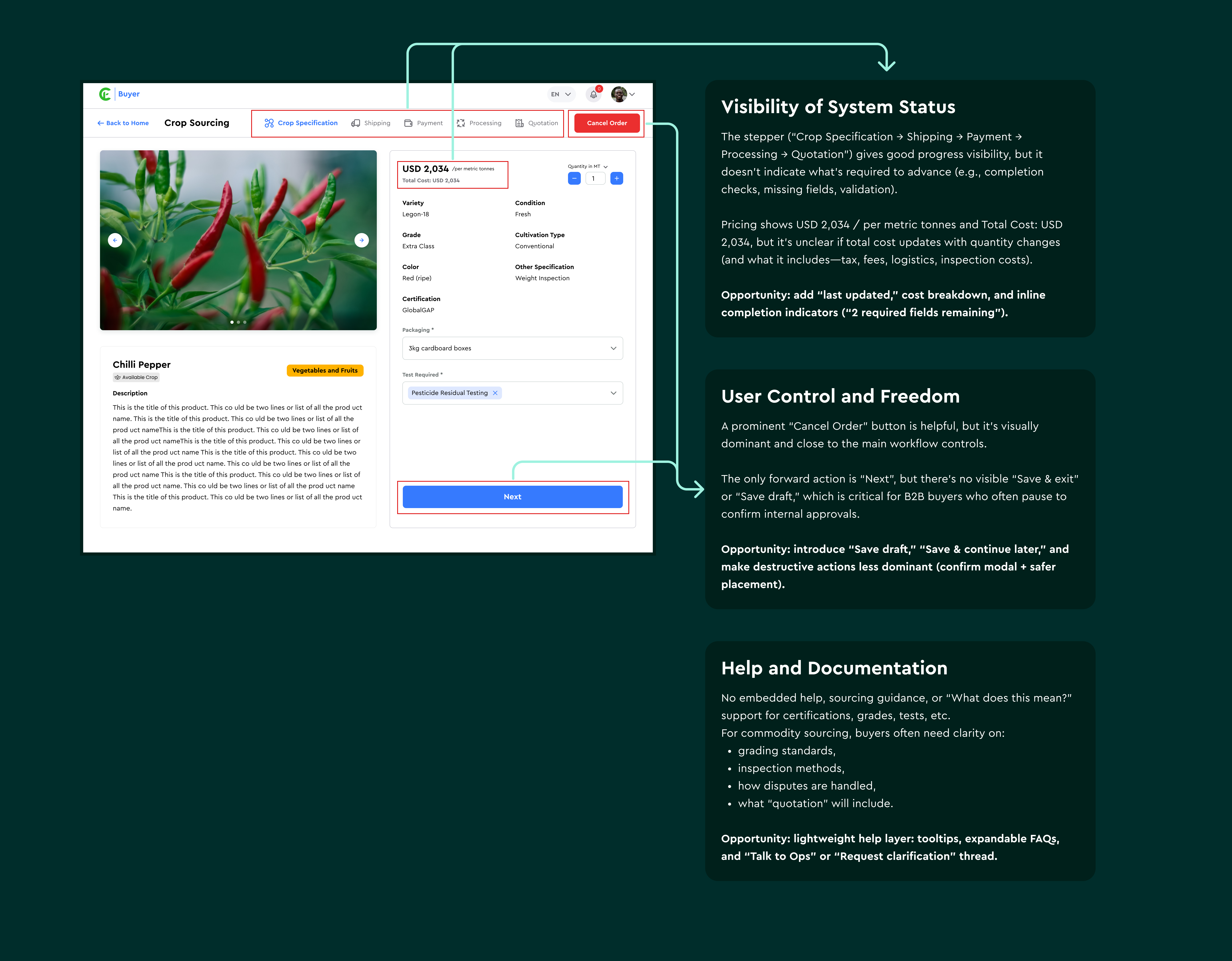
The existing dashboard was functional but cognitively expensive. Information hierarchy was uneven, key insights were scattered, and buyers had to do too much mental math to understand supply confidence, pricing context, and what would happen next. The flow leaned heavily on manual inputs without enough decision support, creating friction at the exact point where buyers needed reassurance. In short: the dashboard asked buyers to work harder than the software and that’s the wrong trade.
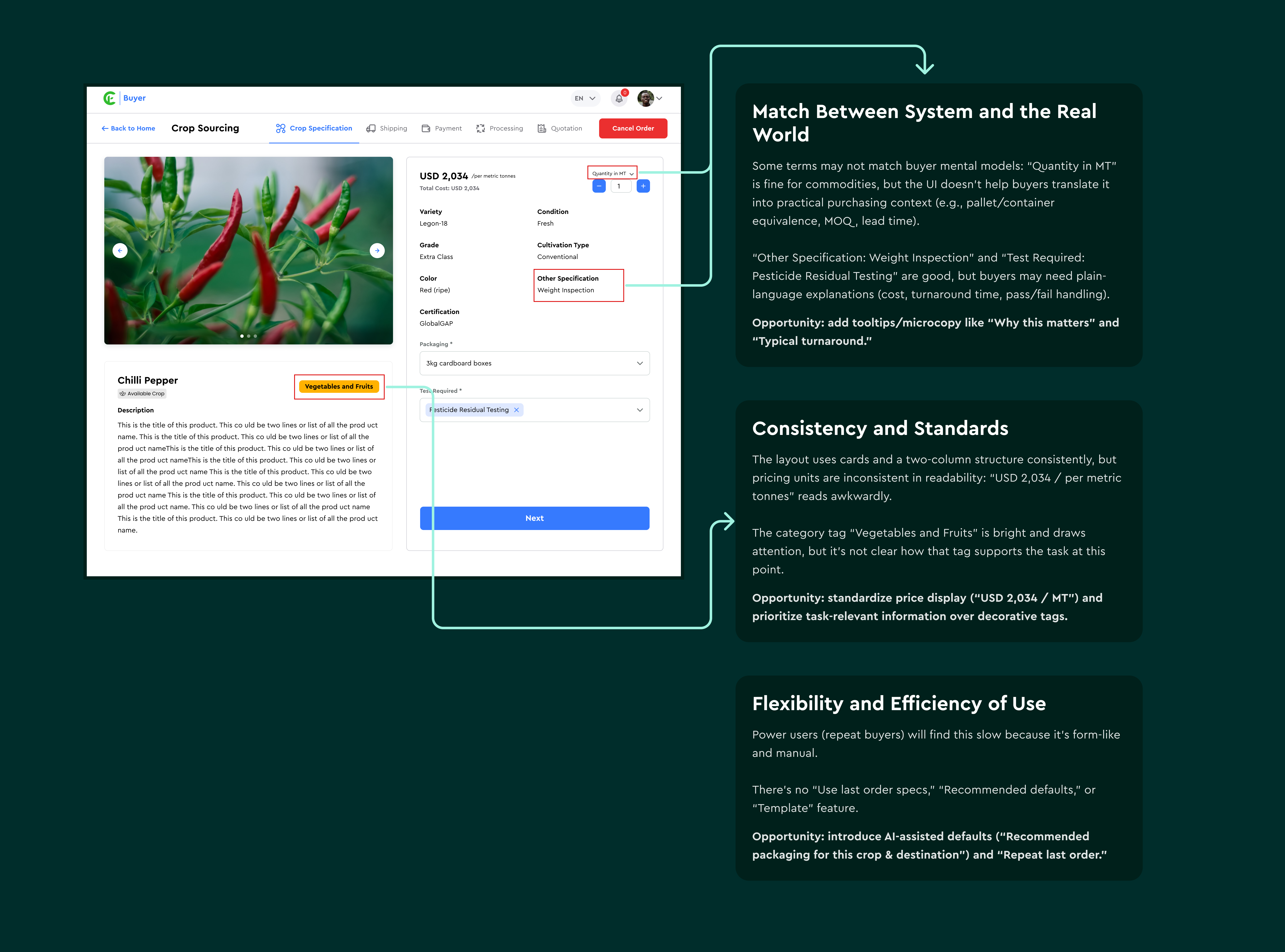

Strategy Shift: Introducing AI Optimization
After the audit, it became clear the fix wasn’t “another UI cleanup.” The dashboard needed to think with the buyer.
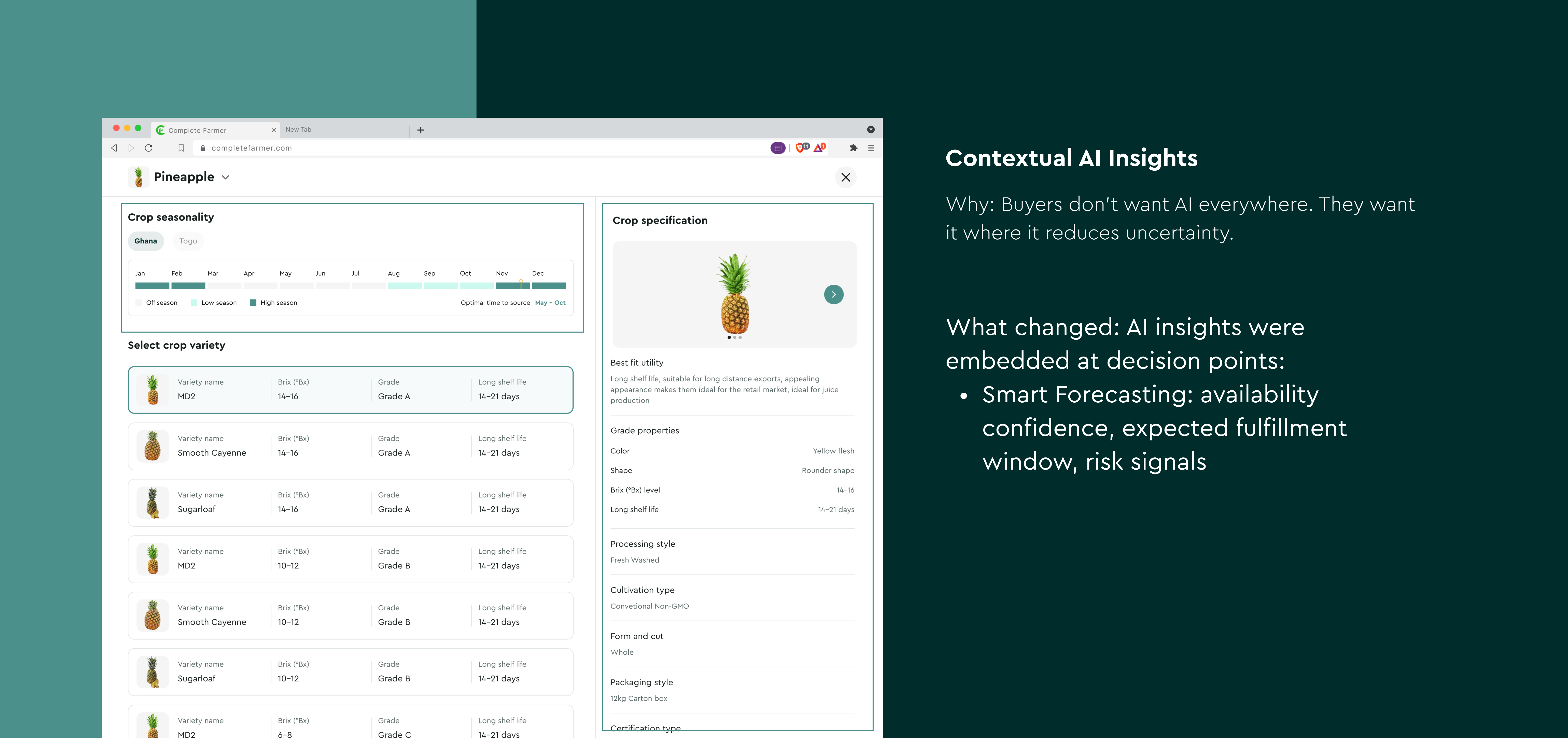
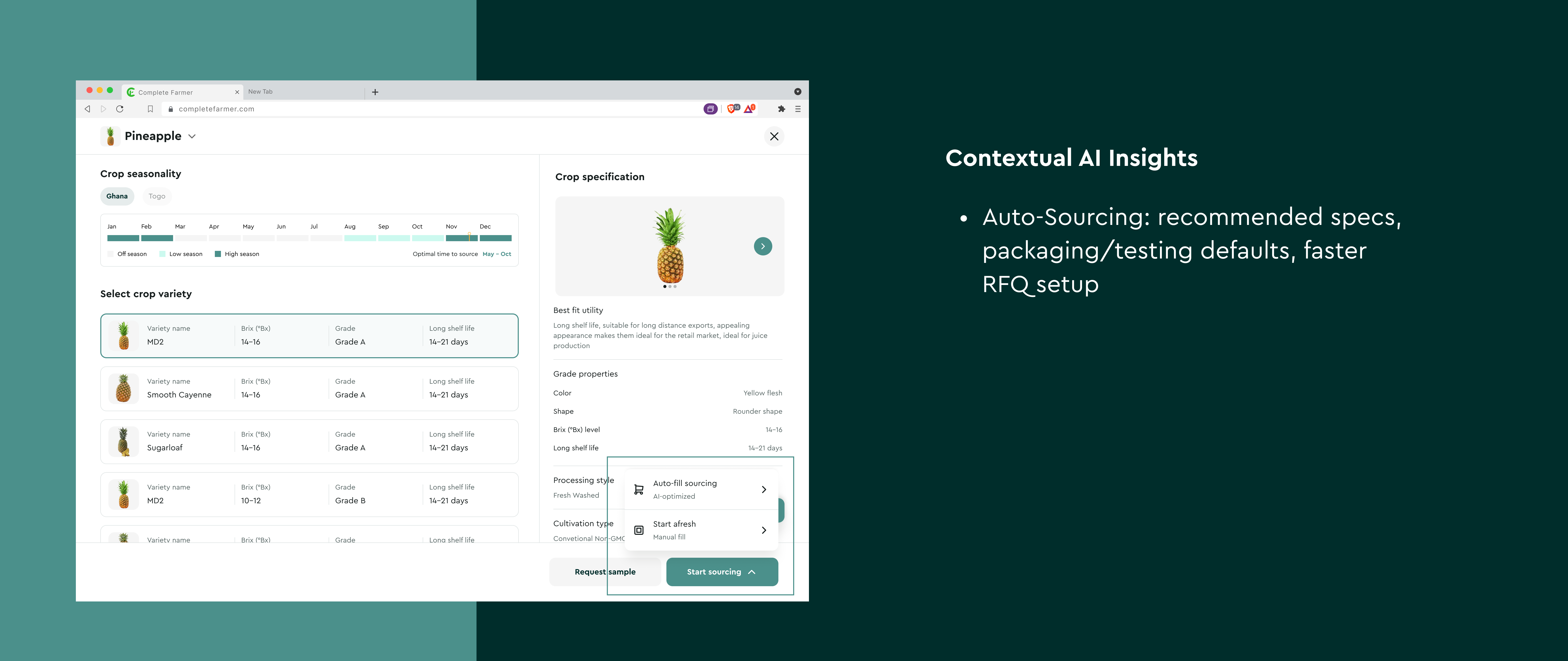
AI optimization became the strategy because sourcing decisions depend on patterns: seasonality, historical pricing, forecasted availability, certification requirements, and buyer purchase history. AI let us shift the experience from reactive and form-based to proactive and guided using progressive disclosure, contextual recommendations, and smart alerts that appear only when they’re relevant.
And yes—because buyers shouldn’t need a PhD in dashboard archaeology to find the one insight that matters. 😅

Design Process
I treated this like a redesign of a living system, respect the existing workflow, fix what’s broken, and strengthen what already works.
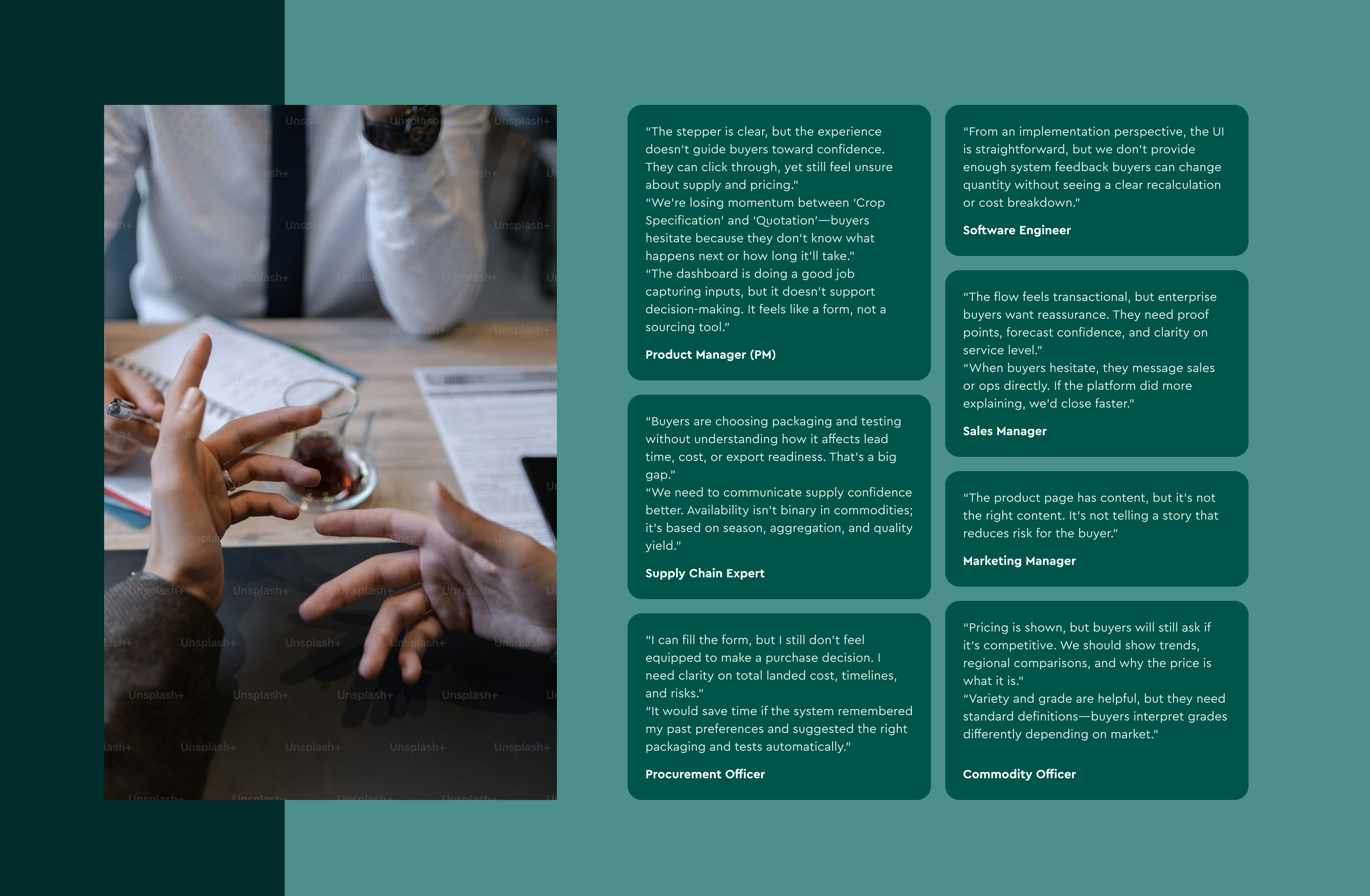
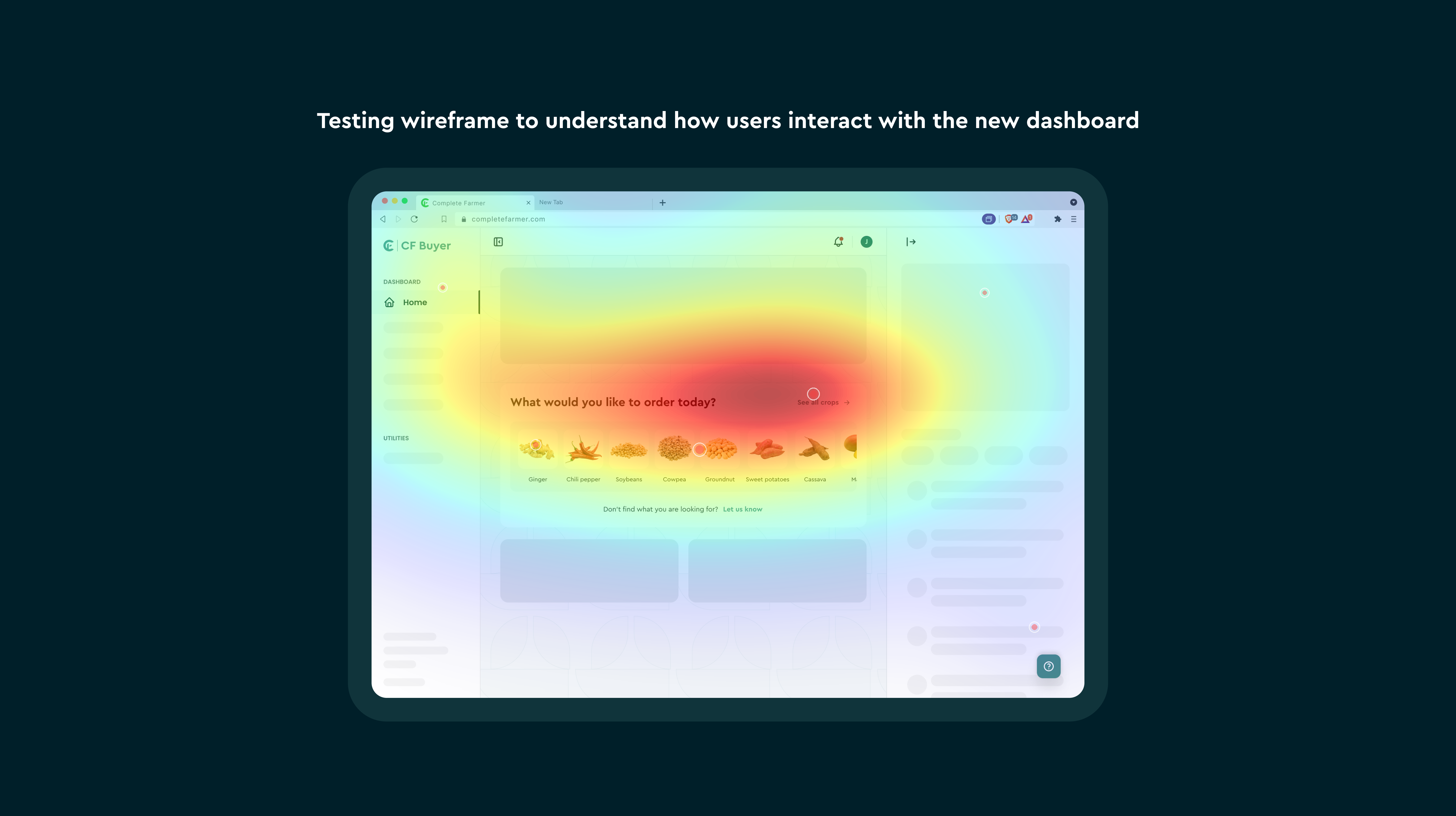
First came the audit: heuristic review, analytics signals, and a flow walk-through to identify drop-off points and confusion hotspots. Then I interviewed stakeholders across product, engineering, ops/supply chain, and commercial teams to understand what buyers complain about, what internal teams manually patch, and where data gaps show up in real operations.
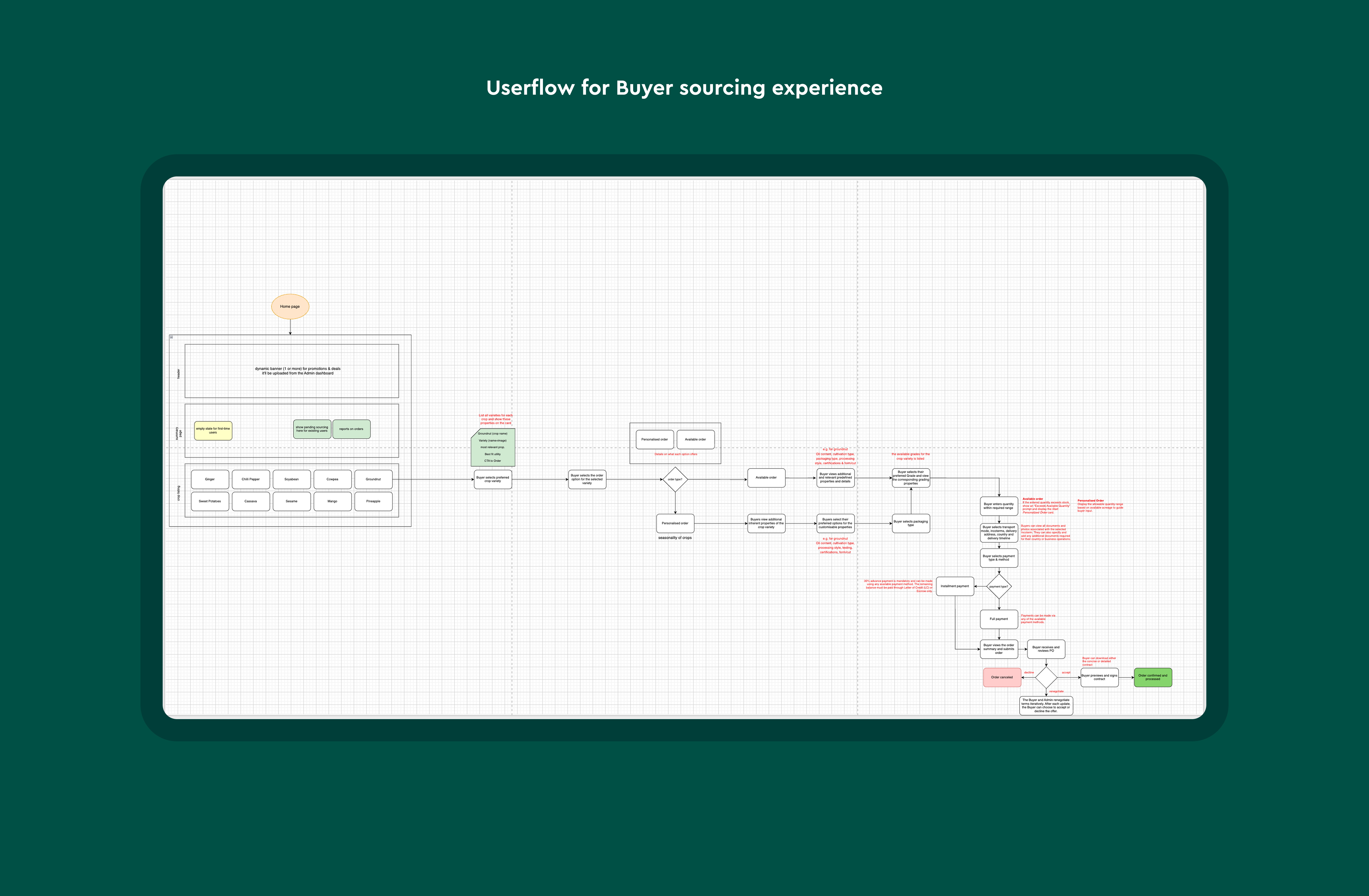
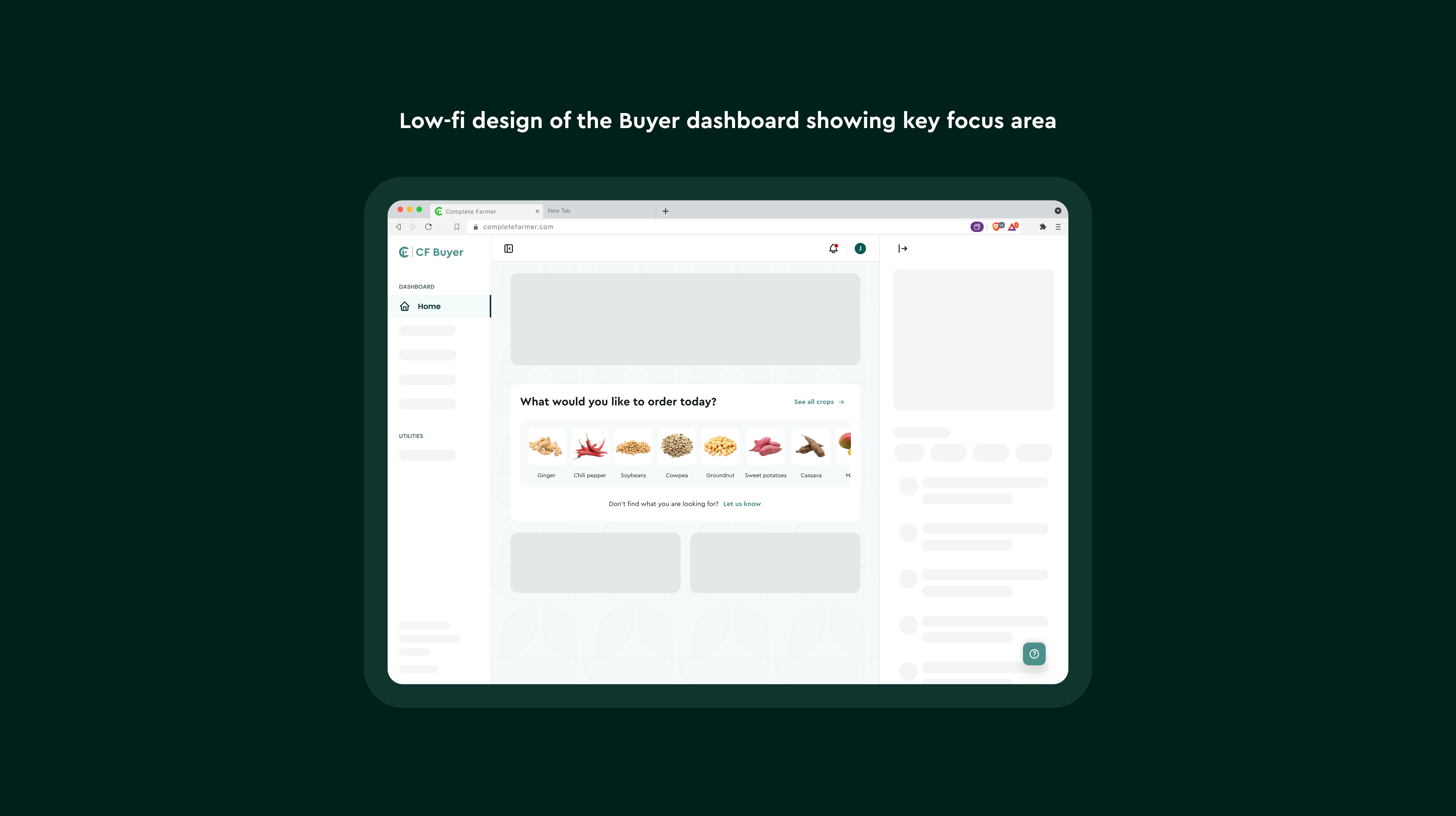
From there, I mapped the sourcing workflow as it actually happens where buyers pause, where they ask for help, where they second guess pricing, and where ops steps in. That workflow map guided an information architecture refinement: we reorganized content around decision moments (availability → price → compliance → fulfillment) instead of UI sections.
Then came wireframes to prove the new hierarchy and progressive disclosure, UI refinement aligned to the design system, and iterative validation through prototype testing focused on clarity, confidence, and speed.

Outcomes & Impact
After rollout (or in pilot validation), we tracked outcomes aligned to user and business goals:
- Reduced decision time by ~30% (time from crop selection → “ready to request quote”)
- Improved sourcing task completion by ~25% (fewer drop-offs mid-flow)
- Reduced cognitive overload (qualitative) via post-task survey feedback (“I understood what to do next”)
- Increased buyer confidence through clearer forecasting and pricing context
- Reduced ops follow-ups by ~20% for basic clarification (tests, packaging, pricing questions)
Lessons Learned
- Designing AI responsibly means designing trust. Confidence scores, “why this recommendation” explanations, and transparency mattered more than flashy AI labels.
- Automation needs an escape hatch. Buyers loved smart defaults but only when they could override them easily.
- Progressive disclosure is underrated. Clarity isn’t about fewer features; it’s about showing the right thing at the right time.
- Stakeholder alignment is a design tool. The fastest way to kill a sourcing experience is misalignment between product intent and operational reality.
Final Reflection
This redesign reinforced a principle I’ve seen across B2B products: buyers don’t need more data they need better decisions. By reworking hierarchy, reducing cognitive load, and introducing AI where it genuinely helped (forecasting, price intelligence, and auto-sourcing), the dashboard became less like a form and more like a guide.
Good dashboards show data. Great dashboards guide decisions.

Let’s Connect


